Introduction :
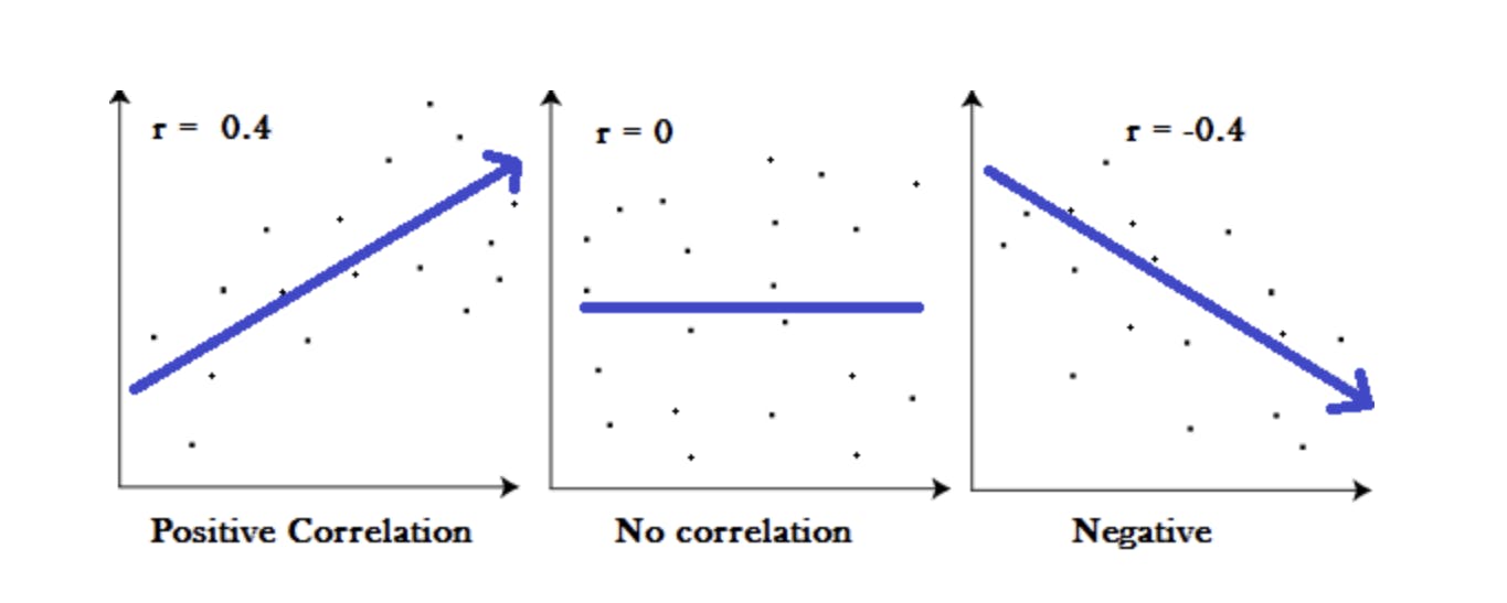
Correlation is a statistical measure that indicates the extent to which two or more variables fluctuate together. Positive Correlation indicates the extent to which those variable increase or decrease in parallel; Negative Correlation indicates the extent to which one variable increases as the other decreases.
Correlation Coefficient :
- A correlation coefficient is a way to put a value to the relationship.
- Correlation Coefficient has a value between -1 and 1
- A “0” means there is no relationship between the variables at all.
- While -1 or 1 means that there is a perfect negative or positive correlation.
Example :
Regression Analysis :
It is a Statistical method To determine whether there is a relationship between two variables.
Response variable and the explanatory variable are continuous variables (i.e. real numbers with decimal places — things like heights, weights, volumes, or temperatures).
Definition:
To predict the value of an outcome variable Y based on one or more input predictor variables X.
Aim:
To establish a linear relationship (a mathematical formula) between the predictor variable(s) and the response variable, so that, we can use this formula to estimate the value of the response Y, when only the predictors (Xs) values are known.
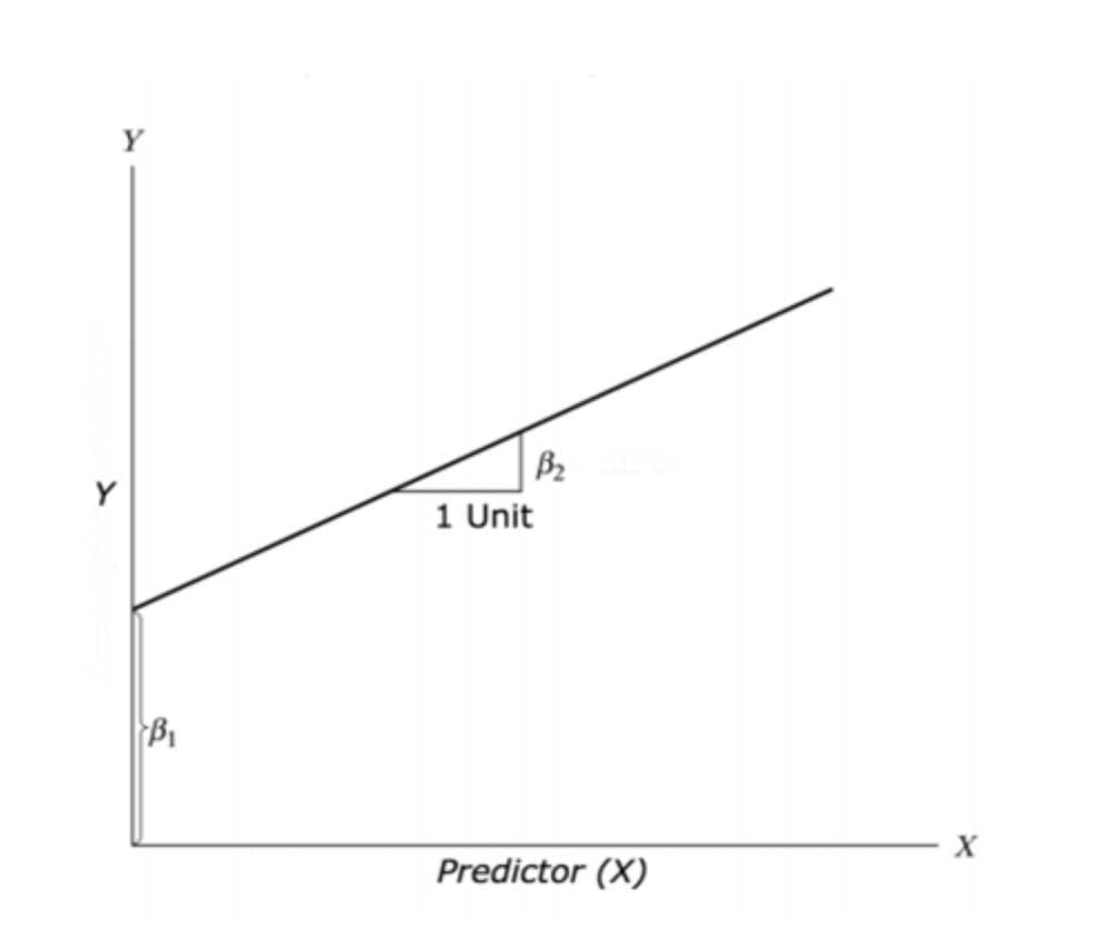
Y = β1 + β2X + ε
• β1 is the intercept and β2 is the slope.
• Collectively, they are called regression coefficients.
• ε is the error term, the part of Y the regression model is unable to explain.
The assumptions for linear regression are:
Linearity: the relationship between X and Y is linear;
Homoscedasticity: the variance of residuals is the same for any given value of X;
Independence: all observations are independent of each other;
Normality: Y is normally distributed for any given value of X.
Problem Statement :
Focusing only on blood characteristics (leaving out the body size), the goal is building a simple regression model that can be use to predict hematocrit (hc) by establishing a statistically significant linear relationship with hemaglobin (hg).
Dataset Details :
For the current analysis, AIS dataset coming from the CRAN package DAAG has been used: it’s a data frame with 202 observations and 13 variables. It represents a study on a group of australian athletes to predict hematocrit (hc) by establishing a statistically significant linear relationship with hemaglobin (hg).
below I’m writing the code for displaying the datasets using R Libraries.
Graphical Analysis :
To predict hematocrit (hc) by establishing a statistically significant linear relationship with hemaglobin (hg).
- Scatter plot: Visualize the linear relationship between the predictor and response.
qplot(HEMAGLOBIN, HEMATOCRIT, data = newdata,
      main = "HEMAGLOBIN and HEMATOCRIT relationship") +
      theme(plot.title = element_text(hjust = 0.5)) +
      geom_point(colour = "blue", size = 1.5) +
      scale_y_continuous(breaks = c(30:65), minor_breaks = NULL) +
      scale_x_continuous(breaks = c(10:25), minor_breaks = NULL)
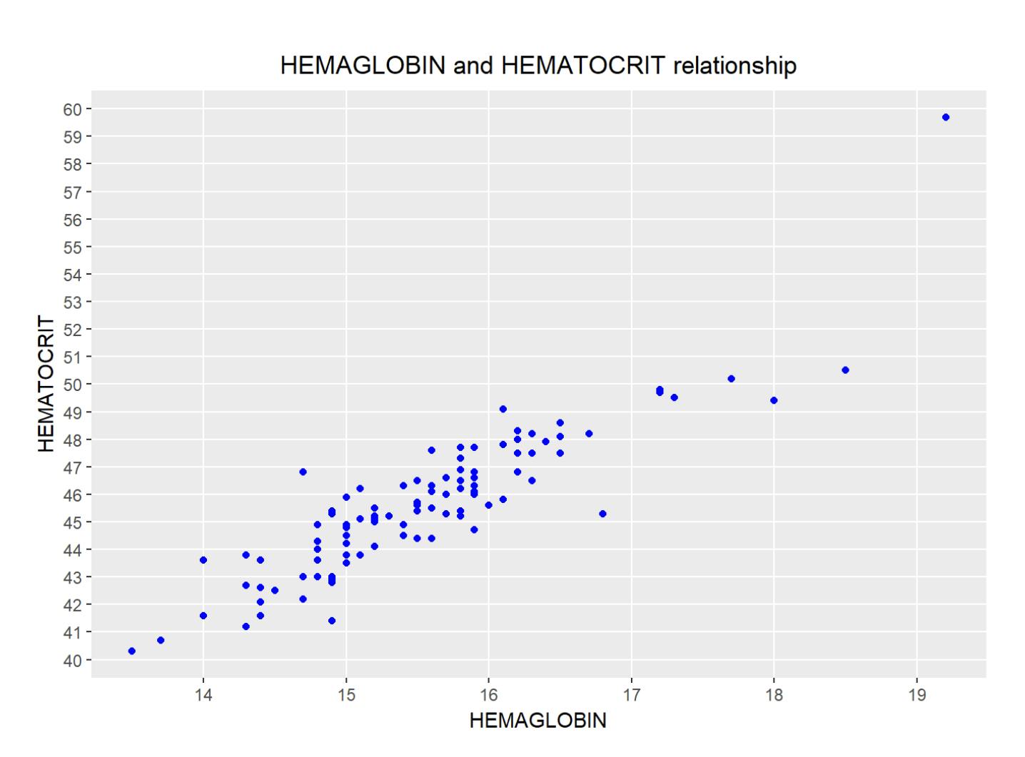
Plot shows there is a strong relationship between hemaglobin’s level and hematocrit percentage.
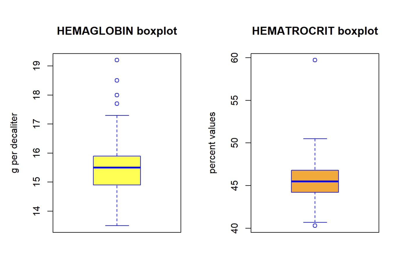
2. Box Plot: To spot any outlier observations in the variable. Having outliers in your predictor can drastically affect the predictions as they can easily affect the direction/slope of the line of best fit.
Box Plot ( Check for outliers ) :
Generally, any datapoint that lies outside the 1.5 interquartile-range (1.5 IQR) is considered an outlier, where, IQR is calculated as the distance between the 25th percentile and 75th percentile values for that variable.
par(mfrow=c(1, 2))  # it divides graph area in two parts

boxplot(newdata$HEMAGLOBIN, col = "yellow", border="blue",
        main = "HEMAGLOBIN boxplot",
        ylab = "g per decaliter")

boxplot(newdata$HEMATOCRIT, col = "orange", border="blue",
        main = "HEMATROCRIT boxplot",
        ylab = "percent values")
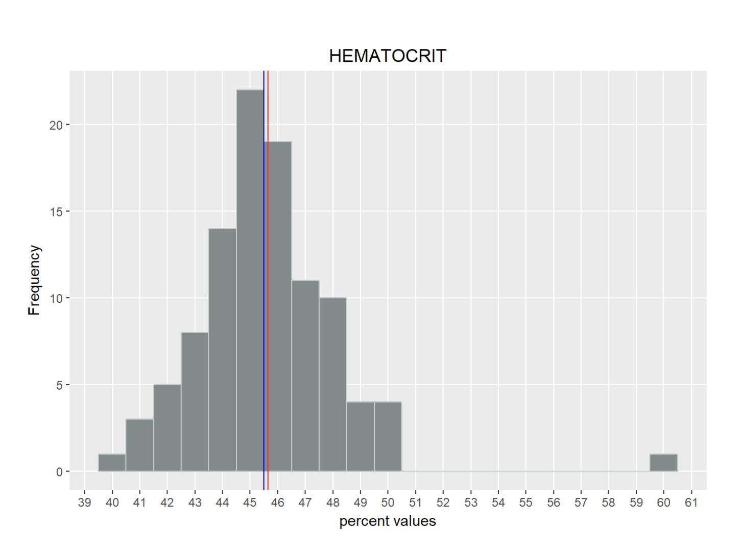
3. Histogram : It displays the probability distribution of the numerical data
# Histogram of HEMAGLOBIN
qplot(HEMAGLOBIN, data = newdata, geom="histogram", binwidth=0.5,
      fill=I("azure4"), col=I("azure3")) +
  labs(title = "HEMAGLOBIN") +
  theme(plot.title = element_text(hjust = 0.5)) +
  labs(x ="Concentration (in g per decaliter)") +
  labs(y = "Frequency") +
  scale_y_continuous(breaks = c(0,5,10,15,20,25,30,35,40,45,50), minor_breaks = NULL) +
  scale_x_continuous(breaks = c(10:25), minor_breaks = NULL) +
  geom_vline(xintercept = mean(newdata$HEMAGLOBIN), show_guide=TRUE, color
             ="red", labels="Average") +
  geom_vline(xintercept = median(newdata$HEMAGLOBIN), show_guide=TRUE, color
             ="blue", labels="Median")
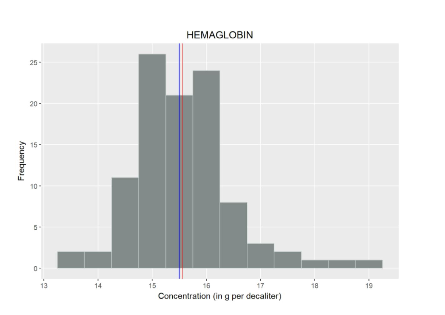
# Histogram of HEMATOCRIT
qplot(HEMATOCRIT, data = newdata, geom="histogram", binwidth=1,
      fill=I("azure4"), col=I("azure3")) +
  labs(title = "HEMATOCRIT") +
  theme(plot.title = element_text(hjust = 0.5)) +
  labs(x ="percent values") +
  labs(y = "Frequency") +
  scale_y_continuous(breaks = c(0,5,10,15,20,25), minor_breaks = NULL) +
  scale_x_continuous(breaks = c(30:65), minor_breaks = NULL) +
  geom_vline(xintercept = mean(newdata$HEMATOCRIT), show_guide=TRUE, color
             ="red", labels="Average") +
  geom_vline(xintercept = median(newdata$HEMATOCRIT), show_guide=TRUE, color
             ="blue", labels="Median")
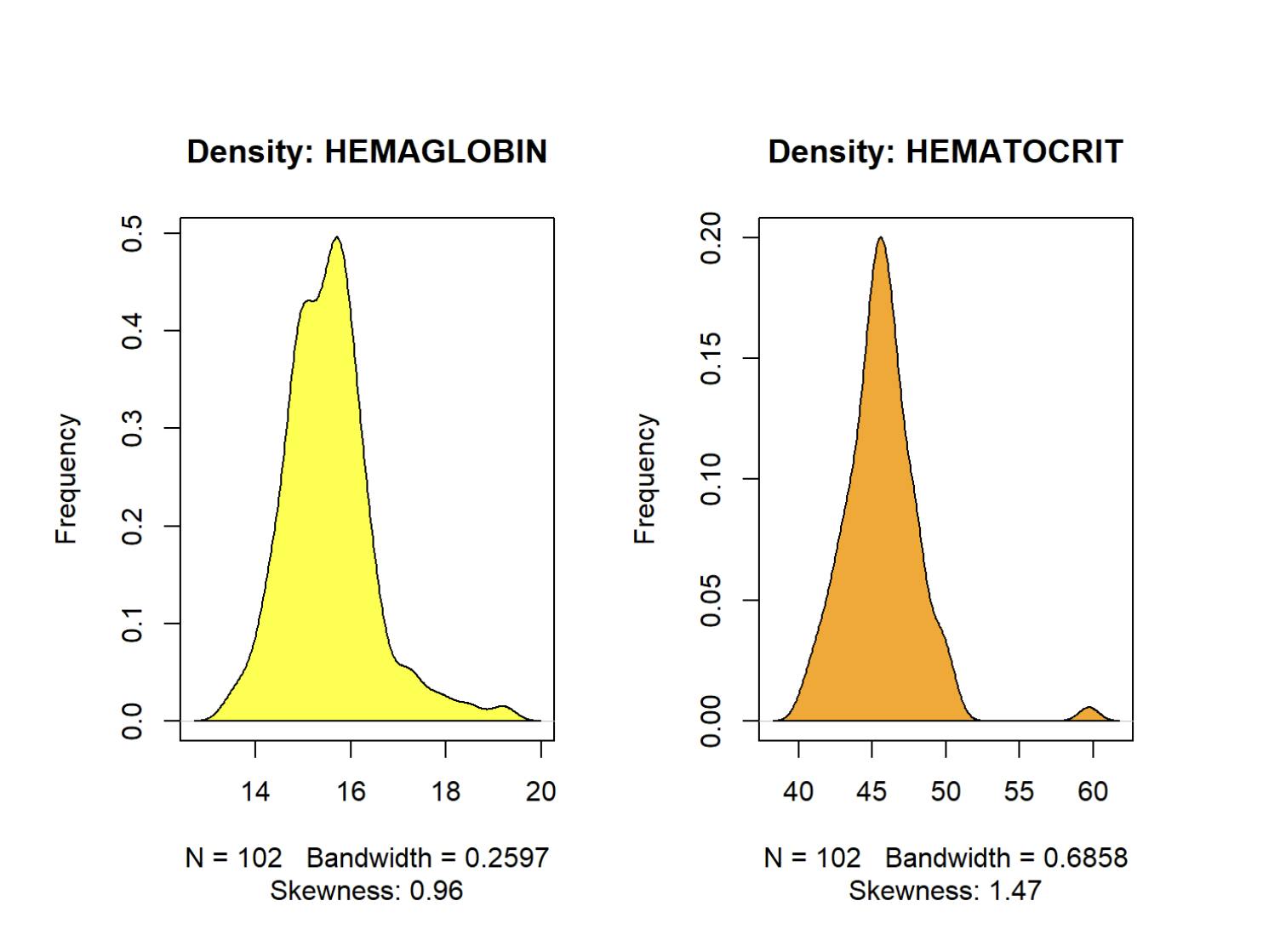
4. Density Plot : To see the distribution of the predictor variable. Ideally, a close to normal distribution (a bell shaped curve), without being skewed to the left or right is preferred. Let us see how to make each one of them.
par(mfrow=c(1, 2))  # it divides graph area in two parts

plot(density(newdata$HEMAGLOBIN), main="Density: HEMAGLOBIN", ylab="Frequency",
     sub=paste("Skewness:", round(e1071::skewness(newdata$HEMAGLOBIN), 2)))
     polygon(density(newdata$HEMAGLOBIN), col="yellow")

plot(density(newdata$HEMATOCRIT), main="Density: HEMATOCRIT", ylab="Frequency",
     sub=paste("Skewness:", round(e1071::skewness(newdata$HEMATOCRIT), 2)))
     polygon(density(newdata$HEMATOCRIT), col="orange")
Building linear model:
Objective now is building a linear model and see how well this model fits the observed data. In a simplistic form, equation to solve is the following:
The function used for building linear models is lm().
• The lm() function takes in two main arguments, namely:
- Formula
- Data.
• The data is typically a data.frame and the formula is a object of class formula & The most common convention is to write out the formula directly in place of the argument.
• Hematocrit=β0+β1 HemaglobinHematocrit=β0+β1 Hemaglobin
• So, the intercept is the expected hematocrit value for the hemaglobin level and the slope is the increase of hematocrit associated with a one-unit increase in hemaglobin level.
# Show the relationship creating a regression line
qplot(HEMAGLOBIN, HEMATOCRIT, data = newdata,
      main = "HEMAGLOBIN and HEMATOCRIT relationship") +
      theme(plot.title = element_text(hjust = 0.5)) +
      stat_smooth(method="lm", col="red", size=1) +
      geom_point(colour = "blue", size = 1.5) +
      scale_y_continuous(breaks = c(30:65), minor_breaks = NULL) +
      scale_x_continuous(breaks = c(10:25), minor_breaks = NULL)
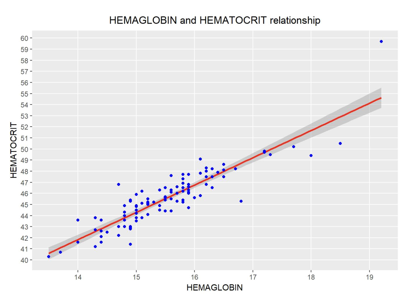
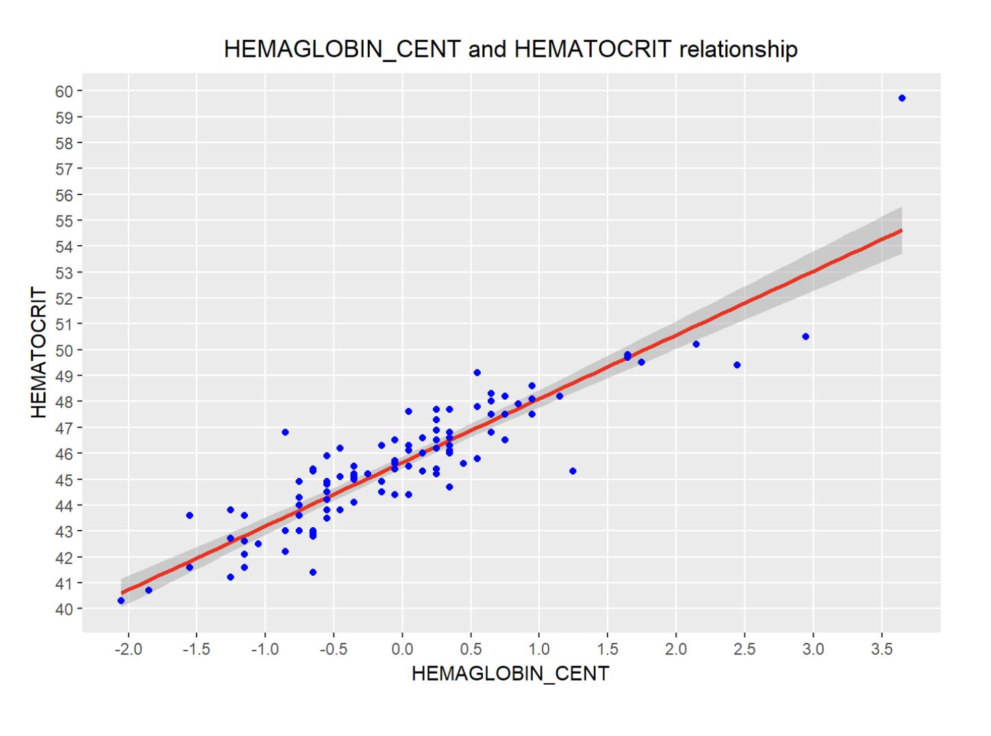
Note: Ideally, the regression line should be as close as possible to all data points observed. Smoothing is set to a confidence level of 0.95 (by default).
An additional and interesting possibility is to create a new variable named “ HEMAGLOBIN_CENT ”, that Centers the value of the variable HEMAGLOBIN on its mean: this is useful to give a meaningful interpretation of its intercept estimate (the average HEMAGLOBIN level is centered on value 0.0 on X-axis).
set.seed(123) # setting seed to reproduce results of random sampling
HEMAGLOBIN_CENT = scale(newdata$HEMAGLOBIN, center=TRUE, scale=FALSE) # center the variable
# Show the relationship with new variable centered, creating a regression line
qplot(HEMAGLOBIN_CENT, HEMATOCRIT, data = newdata,
      main = "HEMAGLOBIN_CENT and HEMATOCRIT relationship") +
      theme(plot.title = element_text(hjust = 0.5)) +
      stat_smooth(method="lm", col="red", size=1) +
      geom_point(colour = "blue", size = 1.5) +
      scale_y_continuous(breaks = c(30:65), minor_breaks = NULL) +
      scale_x_continuous(breaks = c(-2,-1.5,-1,-0.5,0,0.5,1,1.5,2,2.5,3,3.5,4), minor_breaks = NULL)
Linear model analysis:
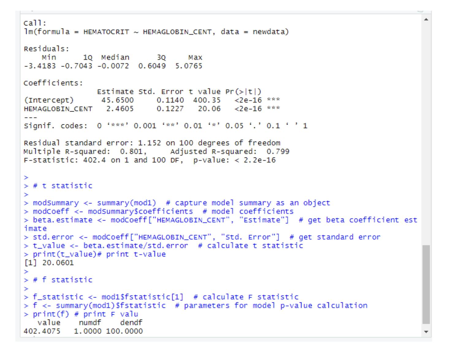
Summary statistics are very useful to interpret the key components of the linear model output.
mod1 = lm(HEMATOCRIT ~ HEMAGLOBIN_CENT, data = newdata)
summary(mod1)
Linear Regression Diagnostics:
1. The p value: Checking for statistical significance
• The model p-Value (bottom last line) and the p- Value of individual predictor variables (extreme right column under ‘Coefficients’).
• a linear model to be statistically significant only when both these p-Values are less that the pre- determined statistical significance level, which is ideally 0.05 .
• This is visually interpreted by the significance stars at the end of the row. The more the stars beside the variable’s p-Value, the more significant the variable.
2. Null and alternate hypothesis
• In Linear Regression, the Null Hypothesis is that the coefficients associated with the variables is equal to zero. • The alternate hypothesis is that the coefficients are not equal to zero (i.e. there exists a relationship between the independent variable in question and the dependent variable).
3. t-value
• A larger t-value indicates that it is less likely that the coefficient is not equal to zero purely by chance. So, higher the t-value, the better.t-statistic is used in a t-test in order to decide if support or reject the null hypothesis.
Note: t-statistic is the estimated value of the parameter (coefficient/slope) divided by its standard error.
Then, this statistic is a measure of the likelihood that the actual value of the parameter is not zero. A larger t-value indicates that it is less likely that the coefficient is not equal to zero purely by chance.
What this means to us?
• When p Value is less than significance level (< 0.05) , we can safely reject the null hypothesis that the co-efficient β of the predictor is zero.
• In our case, linear Mod, both these p-Values are well below the 0.05 threshold, so we can conclude our model is indeed statistically significant.
modSummary <- summary(mod1)  # capture model summary as an object
modCoeff <- modSummary$coefficients  # model coefficients
beta.estimate <- modCoeff["HEMAGLOBIN_CENT", "Estimate"]  # get beta coefficient estimate
std.error <- modCoeff["HEMAGLOBIN_CENT", "Std. Error"]  # get standard error
t_value <- beta.estimate/std.error  # calculate t statistic
print(t_value) # print t-value
4. R- Squared :
The actual information in a data is the total variation it contains. R-Squared tells us is the proportion of variation in the dependent (response) variable. Note: We don’t necessarily discard a model based on a low R-Squared value. Its a better practice to look at the AIC and prediction accuracy on validation sample when deciding on the efficacy of a model.
5. Adjusted R-Squared
the R-Squared value of the new bigger model will always be greater than that of the smaller subset. This is because, since all the variables in the original model is also present, their contribution to explain the dependent variable will be present in the super-set as well, therefore, whatever new variable we add can only add (if not significantly) to the variation.
Note: R-squared value tends to increase as more variables are included in the model. So, adjusted R-squared is the preferred measure as it adjusts for the number of variables considered.
6. F- Statistic:
Basically, F-test compares the model with zero predictor variables (the intercept only model), and suggests whether the added coefficients improve the model. If a significant result is obtained, then the coefficients included in the model improve the model’s fit. So, F statistic defines the collective effect of all predictor variables on the response variable. In this model, F=102.3 is far greater than 1.
f_statistic <- mod1$fstatistic[1]  # calculate F statistic
f <- summary(mod1)$fstatistic  # parameters for model p-value calculation
print(f) # print F value
Model Improvement:
Model summary as well as diagnostic plots have given important information that allow to improve the model fit. Together with mod1, it is possible to explore the mod2 that omits the noticed outliers.
Note: of course, different models could be considered, i.e. including a quadratic term or adding one or more variables (or considering a new transformation of variables), but it’s out of the scope of the current document (it becomes a multiple regression problem).
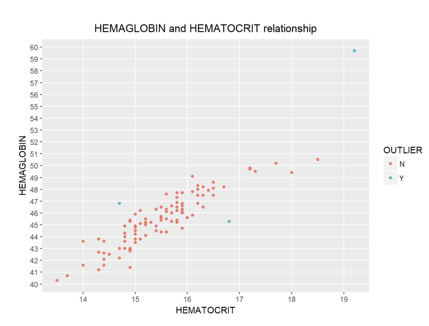
Blue points represent the three outliers indentified.
newdata2 <- subset(newdata1, OBS != 159 & OBS != 166 & OBS != 169,
                  select=c(HEMAGLOBIN, HEMATOCRIT))
HEMAGLOBIN_CENT = scale(newdata2$HEMAGLOBIN, center=TRUE, scale=FALSE) # center the variable
A new model is so given, and shows the following results:
mod2 = lm(HEMATOCRIT ~ HEMAGLOBIN_CENT, data = newdata2)
summary(mod2)
Diagnostic plots are summarized in the graph below:
par(mfrow = c(2,2)) # display a unique layout for all graphs
plot(mod2)
AIC and BIC
The Akaike’s information criterion — AIC (Akaike, 1974) and the Bayesian information criterion — BIC (Schwarz, 1978) are measures of the goodness of fit of an estimated statistical model and can also be used for model selection. Both criteria depend on the maximized value of the likelihood function L for the estimated model.
Note: For model comparison, the model with the lowest AIC and BIC score is preferred.
AIC(linearMod) # AIC => 419.1569 BIC(linearMod) # BIC => 424.8929

Predicting Linear Models :
So far we have seen how to build a linear regression model using the whole dataset. If we build it that way, there is no way to tell how the model will perform with new data. So the preferred practice is to split your dataset into a 80:20 sample (training:test), then, build the model on the 80% sample and then use the model thus built to predict the dependent variable on test data.
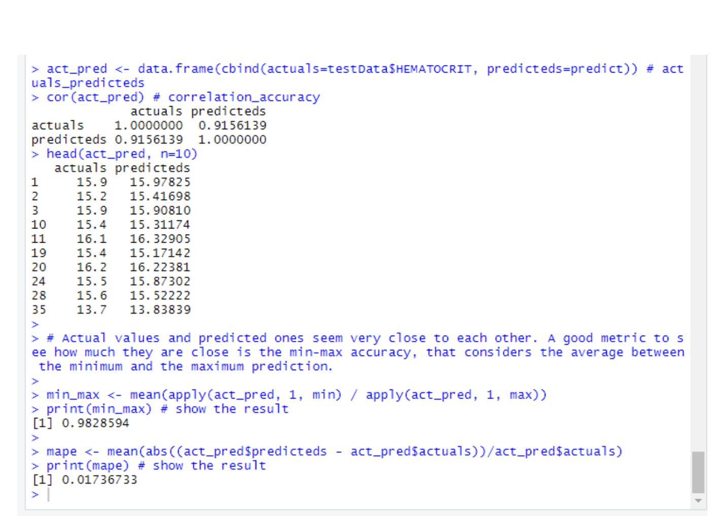
Doing it this way, we will have the model predicted values for the 20% data (test) as well as the actuals (from the original dataset). By calculating accuracy measures (like min_max accuracy) and error rates (MAPE or MSE), we can find out the prediction accuracy of the model. Now, lets see how to actually do this.
Follow the steps below which I am showing to Predict the linear Model.
Step 1: Create the training (development) and test (validation) data samples from original data.
set.seed(123)  # setting seed to reproduce results of random sampling
trainingRowIndex <- sample(1:nrow(newdata2), 0.7*nrow(newdata2))  #  training and testing: 70/30 split
trainingData <- newdata2[trainingRowIndex, ]  # training data
testData  <- newdata2[-trainingRowIndex, ]   # test data
####Step 2: Develop the model on the training data and use it to predict the distance on test data.
modTrain <- lm(HEMATOCRIT ~ HEMAGLOBIN, data=trainingData)  # build the model
predict <- predict(modTrain, testData)  # predicted values
summary(modTrain)
Step 3: Review diagnostic measures.
act_pred <- data.frame(cbind(actuals=testData$HEMATOCRIT, predicteds=predict)) # actuals_predicteds
cor(act_pred) # correlation_accuracy
head(act_pred, n=10)

# Actual values and predicted ones seem very close to each other. A good metric to see how much they are close is the min-max accuracy, that considers the average between the minimum and the maximum prediction.

min_max <- mean(apply(act_pred, 1, min) / apply(act_pred, 1, max))
print(min_max) # show the result

mape <- mean(abs((act_pred$predicteds - act_pred$actuals))/act_pred$actuals)
print(mape) # show the result
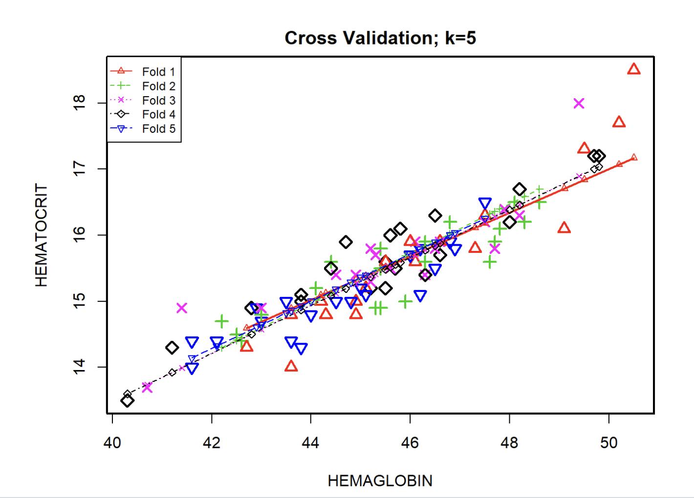
step 4: K- Fold Cross validation.
Suppose, the model predicts satisfactorily on the 20% split (test data), is that enough to believe that your model will perform equally well all the time? It is important to rigorously test the model’s performance as much as possible. One way is to ensure that the model equation you have will perform well, when it is ‘built’ on a different subset of training data and predicted on the remaining data.
# K-Cross Validation

kfold <- CVlm(data = newdata2, form.lm = formula(HEMATOCRIT ~ HEMAGLOBIN), m=5,
                   dots = FALSE, seed=123, legend.pos="topleft",
                   main="Cross Validation; k=5",
                   plotit=TRUE, printit=FALSE)

# The mean squared error measures how a regression line is close to a set of points
attr(kfold, 'ms')

The value of 0.13 is low, and it represents a good accuracy result. ( Ideally, smaller the means squared error is, closer is the line of best fit.)
References:
An Introduction to Statistical Learning and Application in R , James G., Witten D., Hastie T., Tibshirani R., (Springer, 2013).